
Pink and green are back, and they look nothing like the dusty-rose-and-hunter-green combos from decades past. This year’s version feels grounded, layered, and genuinely livable. Plaster pinks meet earthy sage and olive greens. Deep forest tones meet warm blush. The result is a living room that feels collected and personal, not like it walked straight out of a paint store display.
This guide breaks down exactly how to pull off a pink and green living room in 2026 — the specific colors designers are using, smart pairing ratios, real before-and-after makeover ideas, and the mistakes that make this combo feel dated instead of fresh.
Why Pink and Green Is Having a Moment in 2026
Living room color trends shifted hard this year. Cool grays and stark whites are losing ground. Warm, nuanced tones are taking over instead. Plaster pinks and soft dusky rose shades are showing up across major paint lines, and earthy greens like sage, moss, and olive are right there with them.
Two forces are driving this pairing specifically. First, homeowners want color that feels calm rather than loud, and both pink and green can read as soft, grounded neutrals when you choose the right shades. Second, designers keep reaching for green as the backdrop and pink as the accent (or vice versa), because the two sit close enough on the color wheel’s warm-cool spectrum to feel intentional together rather than clashing.
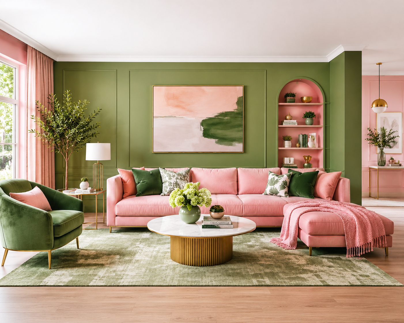
The Best Pink and Green Paint Color Pairings for 2026
Plaster pink + sage or olive green. This is the most popular pairing this year, and for good reason. A muddy, dusky pink like Benjamin Moore’s Whispering Peach or Venetian Portico pairs beautifully with a soft sage like Benjamin Moore’s Gloucester Sage. Neither color competes with the other. They sit in the same tonal family, just on opposite ends.
Dusty rose + deep forest green. This combo leans moodier and more dramatic. Use the forest green (something close to Farrow & Ball’s Calke Green) as an accent wall or on cabinetry, then bring in dusty rose through upholstery, curtains, or a statement chair. It’s a jewel-tone pairing that still feels current rather than heavy.
Blush + classic sage. The softest, most universally livable version of this trend. Both colors sit at a similar light value, so they work well across an entire room rather than needing one to dominate.
Clay pink + moss green. A more terracotta-leaning pink, paired with a muted, almost gray-green moss tone. This combination leans into 2026’s broader earth-tone trend and works especially well in rooms with a lot of natural light or wood furniture.
Raspberry or berry pink + deep green base. The boldest option on this list. Use a deep, nearly black-green as your wall color, then bring in a saturated raspberry pink through pillows, art, or a single statement piece. This works best as an accent strategy, not an all-over wall treatment.
How to Use Pink and Green Without It Looking Dated
The biggest risk with this color pairing is landing somewhere between “tasteful 2026 layering” and “1985 powder room.” A few rules keep it firmly in the former category.
- Choose muted, complex versions of each color, not the saturated pink and green you’d see in a children’s room. Plaster pink, dusty rose, and clay pink all read as sophisticated. Bubblegum pink does not.
- Let one color lead. Pick either pink or green as your dominant wall color, and use the other as a supporting accent. Treating both as equal partners on opposite walls tends to read as busier and more dated than letting one anchor the room.
- Bring in a warm neutral to break up the pairing. Warm white trim, natural wood tones, or a soft greige rug keep the room from feeling like a two-color theme park.
- Add black or brass metal accents. A black-framed mirror, brass sconces, or matte-black hardware add the contrast that keeps a pink-green room from feeling overly soft or sweet.
Color Ratios & Layout: Where to Put Each Color
A simple 60-30-10 split works well for this color combination.
- 60% — your dominant neutral or main color. This is usually your wall color: a plaster pink, sage green, or warm neutral like Sherwin-Williams’ Universal Khaki.
- 30% — your secondary color. This shows up through a sofa, an accent wall, cabinetry, or large furniture pieces. If pink dominates the walls, let green take this role through upholstery or a media console.
- 10% — your accent pop. Pillows, art, ceramics, a lamp base, or a single bold chair. This is where you can afford to go more saturated, since it’s a small dose rather than the whole room.
Two layouts tend to work especially well in real living rooms:
Pink walls, green furniture. A plaster-pink envelope (all four walls) with a sage or forest-green sofa as the anchor piece. Add brass or black accents and warm wood furniture to round it out.
Green walls, pink furniture. A sage or olive accent wall behind the sofa, paired with a dusty rose or blush sofa and a few pink accent pieces scattered through the room. This version tends to feel more grounded since green covers more visual real estate.
Before-and-After Makeover Ideas
The beige box. A standard builder-beige living room with a brown leather sofa gets new life with sage green walls, a blush velvet sofa, brass floor lamps, and a cream jute rug. The room goes from forgettable to intentional without touching the layout.
The dated 90s room. Mauve walls and hunter-green trim get replaced with a plaster pink wall color and a single olive-green accent wall behind the sofa. Warm white trim and updated black hardware finish the refresh — same bones, completely different feel.
The all-white starter home. Plain white walls become a deep forest-green accent wall behind the TV or sofa, paired with dusty rose curtains and a handful of rattan and wood accents. The rest of the walls stay a warm white to keep the room from feeling closed in.
The rental-friendly refresh. No painting allowed? Layer in the trend through textiles instead: a sage green sofa or slipcover, blush pink pillows and throws, terracotta ceramics, and a few well-placed plants. You get most of the visual impact with zero wall paint.
Step-by-Step: How to Paint a Pink and Green Living Room
- Test before you commit. Buy sample pots of your top two or three colors and paint a two-by-two-foot patch on each wall. Light changes color dramatically throughout the day, so check the swatches in the morning, at midday, and again under your evening lamps.
- Pick your dominant color first, then choose your secondary and accent shades to complement it, not the other way around.
- Prep the walls properly. Clean, patch, and sand any imperfections, then prime — especially if you’re painting over a dark or saturated existing color.
- Paint the lighter color first if you’re doing an accent wall, then tape it off cleanly before adding the darker shade.
- Choose the right finish. Matte or eggshell works best on living room walls since it hides imperfections and minor roller marks. Save satin or semi-gloss for trim and doors.
- Let each coat cure fully before moving furniture back, typically 24 hours for paint to dry and up to two weeks to fully cure.
Furniture, Trim & Decor Pairings That Make It Work
- Wood tones: Warm oak, walnut, and rattan all pair naturally with both pink and green, and help keep the room from feeling too “decorated.”
- Metals: Unlacquered brass and matte black both work well; aim for one dominant metal finish rather than mixing several.
- Trim colors: Warm whites (think Benjamin Moore’s White Dove or similar) generally outperform stark, cool whites in a pink-and-green room.
- Textiles: Bouclé, velvet, and linen all carry these colors particularly well, especially in the dustier, more muted shade families.
- Plants: Live greenery reinforces the green half of the palette without adding more paint, and it’s an easy way to test the combination before committing to a full repaint.
Common Mistakes to Avoid
- Going too bright with both colors at once. Saturated pink next to saturated green reads as a theme, not a design choice.
- Skipping the neutral buffer. Without warm white or wood tones somewhere in the room, the pairing can feel flat instead of layered.
- Using the same value for both colors. If your pink and green are exactly the same lightness or darkness, the room can feel visually busy. Let one be noticeably lighter or darker than the other.
- Forgetting the ceiling. A bright white ceiling can sometimes look stark against deep, moody color pairings. Consider a soft warm white instead of a cool, builder-grade white.
If you’re not sure where to start, it often helps to look at a broader living room color palette guide first, then narrow down to the specific pink and green shades that suit your space and lighting.
Quick Trend Cheat Sheet for 2026
- Lead with plaster pink or sage/olive green, not bright primary versions of either color
- Use a 60-30-10 ratio so one color clearly leads
- Add warm neutrals (warm white trim, natural wood) to break up the pairing
- Bring in brass or black metal accents for contrast
- Matte or eggshell finish on walls; satin or semi-gloss on trim
- Test samples in real light before committing to a full room
Frequently Asked Questions
Is pink and green a good color combination for a living room in 2026? Yes, especially in their muted, earthy forms. Plaster pinks and sage or olive greens are among the most popular living room color trends this year, largely because they read as grounded and sophisticated rather than playful or childlike.
What shade of pink pairs best with green in a living room? Muted, dusty pinks — plaster pink, blush, or clay-leaning pinks — pair best with sage, olive, or forest greens. Bright bubblegum or hot pink tends to clash, while these softer, complex pinks sit naturally alongside earthy greens.
Should I paint my living room pink or green? Pick whichever color you want to dominate the room, then use the other as your accent. Pink walls work well with green furniture and accents, while green walls tend to feel slightly more grounded when paired with pink furniture and textiles.
How do I make a pink and green room look modern instead of dated? Choose muted, complex shades rather than saturated primary versions of pink and green, let one color clearly lead instead of splitting the room 50/50, and add warm neutrals and black or brass metal accents for contrast.
What paint finish works best for a living room makeover? Matte or eggshell finishes work best on living room walls because they hide roller marks and minor wall imperfections. Save satin or semi-gloss finishes for trim, doors, and high-touch surfaces.
Can I do a pink and green living room without repainting? Yes. Layer the palette through a sofa or slipcover, throw pillows, curtains, rugs, and plants. This approach works especially well for renters or anyone who wants to test the combination before committing to paint.
What colors should I avoid pairing with pink and green? Cool, icy grays and stark blue-toned whites tend to fight with both colors rather than complement them. Warm whites, natural wood tones, and black or brass metals are safer, more cohesive choices.
A pink and green living room works best when you treat it as one dominant color with a supporting accent, not two competing statements. Start with samples on your actual walls, live with them for a few days, and let your space’s natural light make the final call.
Source referenced: Homes & Gardens — Living Room Color Trends 2026